How to work with text
There is no doubt that text is the final touch to every wallpaper, it's the artists way of sharing his thoughts and ideas with the audience and it is what makes every piece special and unique. Now, there is a lot of ways how to improve the text and this here is just a little summarization of what I like to do, almost with every single one of my wallpapers, I always follow these steps :)Just as a demonstration I picked a couple of my recent wallpapers to demonstrate the techniques. We will be working with these:




First step is always based on the whole composition of your piece, the mood, the colour scheme... You shouldn't be afraid of experimenting and just simply trying out different combinations, because art is all about having fun, so dont always stick to your comfort zone and experiment a litle!
When we're adding the text to our piece, it's important to choose the colour of the text, because no matter what masks and colours we will add later, this determines the overall look of the text layer. I dont have to explain that with darker pieces it's better to start with lighter colours for the text and then proceed from there, while with lighter colour schemes we want darker colours for contrast.
But don't worry about this, because you can always go back and change the colour of your main text, and also once you get the hang of the simple tricks, you'll learn that for different pieces you use different styles and sometimes for example light background with light text that is only stressed by contrasting shadow can also be an interesting choice.
Example no.1
We will be creating this text: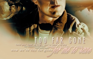
Because the mood of this piece is somehow soft and melancholic, I chose white to be my main and starting colour and wrote the text I wanted to add:
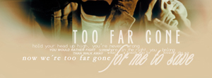
Now, to add a little bit of contrast, my first step is always adding some shadow to the text. So, right click on the text layer and choose Blending Options. You will get a pop-up window, where you will choose the Drop Shadow option and then adjust it to your picture - you can change the opacity, the blend mode or the colour of the shadow so that it fits your colour scheme the best:
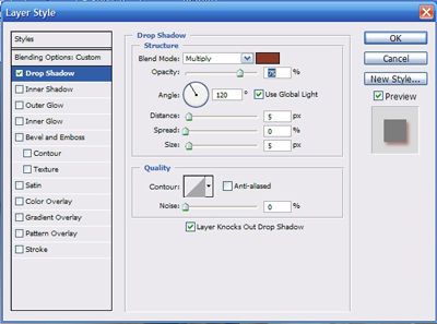
The result should look like this:

We have a little bit of a contrast now. Another tool that I love to use because it really brings out the text is Gradient Overlay. Again, right click on your text layer, choose Blending Options and there go for the Gradient Overlay. Here you can choose what kind of gradient you want to use, depends on how many different kinds you have in your Photoshop of course. And again, try playing a little with the Opacity, Scale and Blending mode, just to see the different outcomes. I applied this gradient:
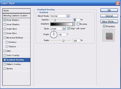
And ended up with this result:

It's not a massive change, but at the end, it's all about the details :) I wanted my result to be a little bit softer and not all that bright, so I changed the Opacity of my layer down to 73%.

Now I repeated these steps for the 2 next lines of my text ("hold your head up high, you're never wrong" + "somewhere in the right, you belong") - here I only added the Drop Shadow (your layer - right click - Blending Options - Drop Shadow) and for the next 2 lines ("you would rather fight" + "than walk away") I applied the Drop Shadow and also Gradient Overlay - I chose this gradient:
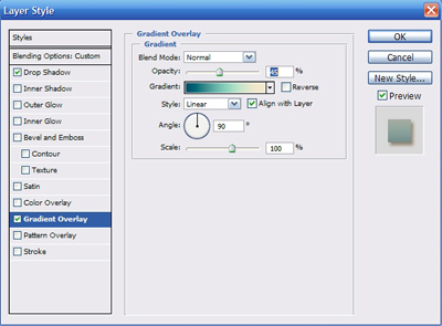
and this is my result:

For the next line ("now we're too far gone") I used another gradient, this time a little bit different in colour, because the font was bigger and more visible so I wanted the colours to go naturally with the background. I used this gradient:
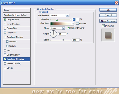
and you can see the result there. My last line of text is the biggest and the most important, so I wanted it to stand out, but also not too much so that it takes attention away from the piece itself. So I applied softer shadow and gradient:
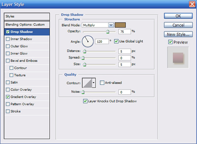
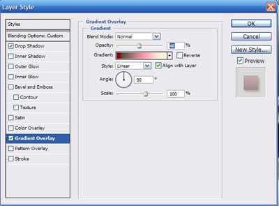
And this is my result:

Because I wanted the layer to be softer, as a final step I took the Opacity down to 61%:
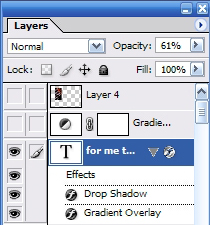
Example no.2
Now we went through the most basic techniques that I find helpful while editing the text. In the next piece I was using mainly these two (Drop Shadow + Gradient Overlay) but also some a little different effects. We will be creating this text: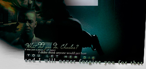
Again, I chose white and lighter shades of grey to be my basic colours:

You can see that the white works quite nicely with the grey background and it gives the piece a very nice contrast, but to me it stood out a little bit too much and it was a bit distracting, especially when the mood of my piece was a lot darker. So I started applying gradients to get rid of all the brightness :) It's a good idea to finish the coloring of your piece and leave the text as a very last thing to do, because then you can use the same gradients that you used for your whole wallpaper and make sure that you get the colours just right. But even if you're using different gradients, it's always good to see the final outcome first, so that you can use it as a sort of reference colour palete. I applied this gradient:
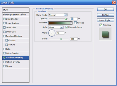
on my very first line of the text and this is the outcome:

As you can see, it looks a lot more natural now. I did the same for the following text layers and when I got to my text layer "YOU LET HER DIE" , I thought that there was still a bit of an empty negative space, which is good sometimes, but this time I wanted to stress the sentence, emphasize the meaning of it. So I duplicated my text layer (layer - right click - Duplicate Layer...) and the rasterized the duplicated layer (layer - right click - Rasterize Layer). Then I went to the upper control panel and chose Filter - Blur - Motion Blur... A pop-up window appears and you can choose how blurred you want your layer to be. I went for this setting and then went back to the original layer and applied this gradient via Gradient Overlay:
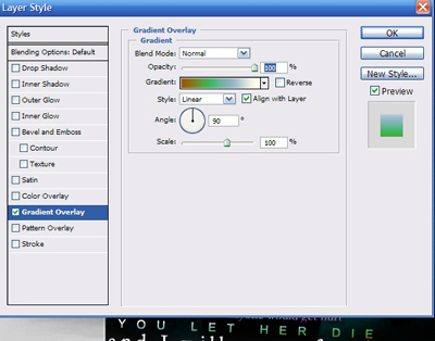
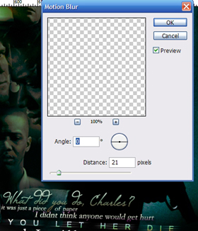
You can see the outcome there. For my last line, I wanted to use the border of my texture and make the last sentence stand out a little more, again to emphasize it a little more. First, I adjusted the colour by applying this gradient:
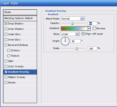
and I got this result:

Then I chose a different kind of effect - make sure that you are really working in the text layer that you are editing and go to the Layers control panel, where you choose "Difference" settings:
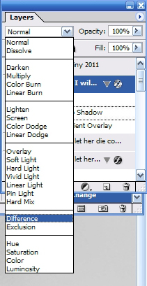
And this is the effect that you get, which is also my final step:

Example no.3
I chose a picture with white background to show the other possibilities we get then. We will be creating this text: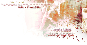
Since this is basically white background and my overall coloring was towards the red and dark purple I chose dark red as a main text colour:
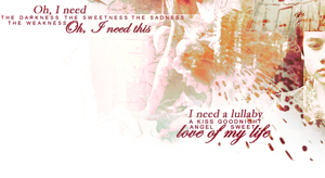
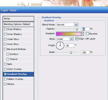
Then I started my traditional adjustments - Drop Shadow and playing with Gradient Overlay, you can see the results above the window with the settings:
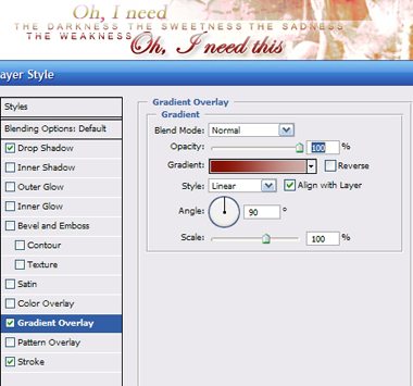
Now another one of the effects that is very useful is Stroke. It helps you when you chose bright text for bright background and they both kind of merge into one and it's hard to tell the text from the rest of the piece. Also sometimes it's just a nice designer touch to bring out the text a little bit. You can find this effect in Blending Options and again, it's up to you what Colour, Opacity and Blend mode and Size you choose. I almost always choose size 1, because I dont want the stroke to be too eye-catching. I chose this setting:
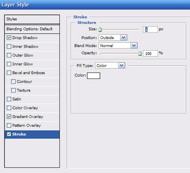
Normally I use darker colours with white background, but here my text was already very nicely visible, so I just liked to soft and simple effect it created:

You can see that the stroke is very thin, at some places barely visible, but it still brings out a little something more.
Example no.4
Here is just a little example of combining the Gradient Overlay with Stroke. This is our final outcome:
I also chose this picture because the whole wallpaper has a very rich and dark coloring and you can see that the normal text with no adjustments seems just a little bit too harsh and out of place here:
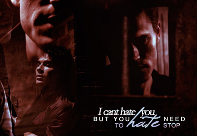
The original text is all in white colour, but because I wanted to make the bottom line a little bit different, I took the opacity down a little bit. Then I applied my first gradient via Gradient Overlay and also the Stroke effect:
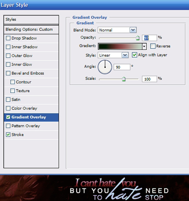
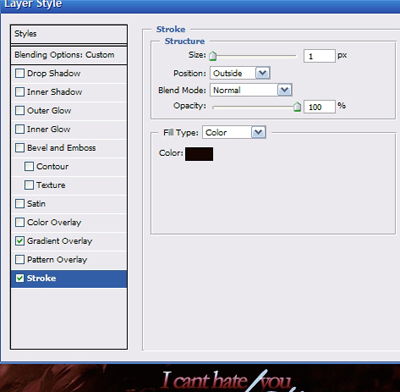
I continued with the same steps for the rest of the text layers:
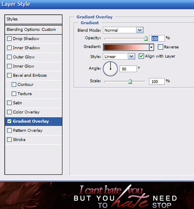
And here is my final outcome:

Example no.5
Another example of combining the above mentioned effects. The layer settings used for this text are Drop Shadow, Gradient Overlay and Stroke. Our final result is this:
Again, I created my basic text in white:
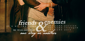
I started with my "friends" line and applied gradient and stroke, effects which I later copied and pasted to the "enemies" layer as well. You can see the results bellow:
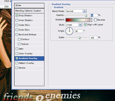
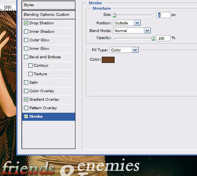
For the following layers I used the same effects only with different gradients and colours, such as for example here:
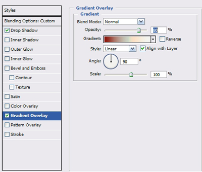
with the following result:

I followed the same scheme and finished the rest of my text lines with this result:

And here you can see an example of effects and colours used for the bottom line of my text:
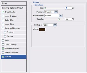
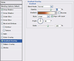
with this outcome:

Example no.6
The reference picture for the last technique I want to show you is this:
You can see the final result above, and I chose this picture because the text is quite big and well visible here. Except for using different options and settings from the Blending Options and different ways of blending the text layers into your picture, what I sometimes like to do to make the text more part of the wallpaper as a whole, is to use part of the wallpaper as a filling for the text layer.
First of all, choose the part of your piece that you would like to use. It shouldn't be anything complicated or bright with sharp edges, because that makes the text layer afterwards very hard to read. So you want to choose a part with nice piece of your textures or background that is interesting, but not too overwhelming. Also you have to realise that if your piece contains different layers, sometimes you have the flatten the image to get the desired effect. Here you can see that I chose the part of my background with the stock photo of the old stairs and stones. So I made sure I was working it that layer and selected the part of the picture that I liked:

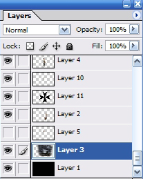
Once you select the part that you want, go to the upper control panel and choose Edit - Define Pattern. You will get a pop-up window where you can choose a name for your pattern and click OK:

And now it's very easy, because once again we're working with the Blending Options (your layer - right click - Blending Options). This time we choose the option Pattern Overlay, pick our defined pattern out of the default selection and play a little bit with the settings - Opacity, Scale...
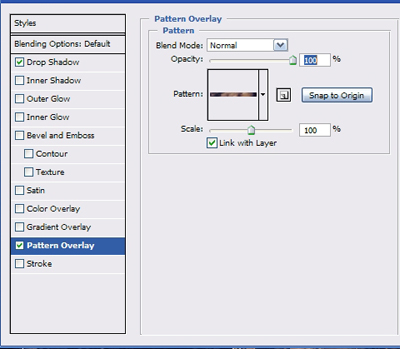
And my result here is this:

Final tips
- There are so many options and so many choices along the way, I only showed you the ones that I use the most often and that are very easy to work with. Each step of the way you can choose something different, different colours, opacities, scales... Don't be affraid to experiment!- Sometimes you can get very nice effects not by applying your adjustments on the text layer, but by moving your text layers under your textures, stock photos... Often you don't need to do any retouching then.
- Often when you're finished with your text and there's still something a little bit off about it, instead of different colours and gradients try to focus on the layer itself - Opacity does very nice effects, especially in case you applied some gradients first.
So, good luck with your arting and if you have any questions about this topic, don't hesitate to ask!
Disclaimer
This website is not connected to any celebrity, television show or movie that's featured in the site. All artwork here were made by me, Destiny. Don´t steal, direct link or whatever, please.


