Wallpaper walkthrough - Night and Day
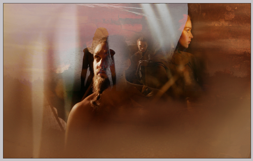
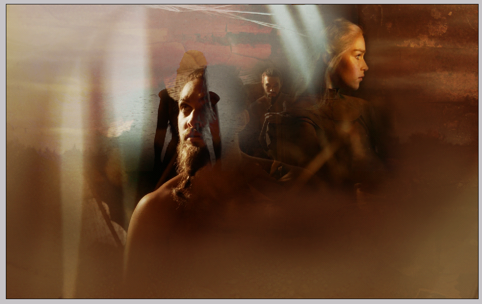
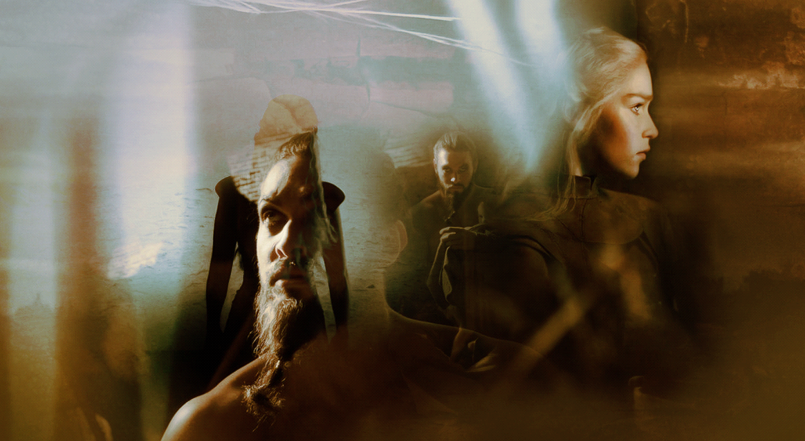
This is a tutorial where I will take you through the process of making this particular wallpaper:
However before we start I would like to say a couple of things. First of all, this is a tutorial showing you just some of the techniques you might find useful. Photoshop is a program with many, many great features and one effect can be achieved by so many different techniques that I would hate for you to limit yourself just to the ones Im showing you here.
This tutorial is made for artists of intermediate level and above, because Im not explaining some of the basics seeing as that would make the whole thing impossibly long to read. Im open to questions though, so if you´d like a closer assistance on any of the things you see below please don't hesitate to ask me.
Lastly, this is a tutorial explaining the making of the piece and I would love nothing more than for you to find it useful. While following it though, please use your own ideas, images, composition etc. - I hate to be pointing this out, but please do not copy my original art, focus on your own piece and ideas and you will see that this way your result will be so much more rewarding :)
That said, let's get started!
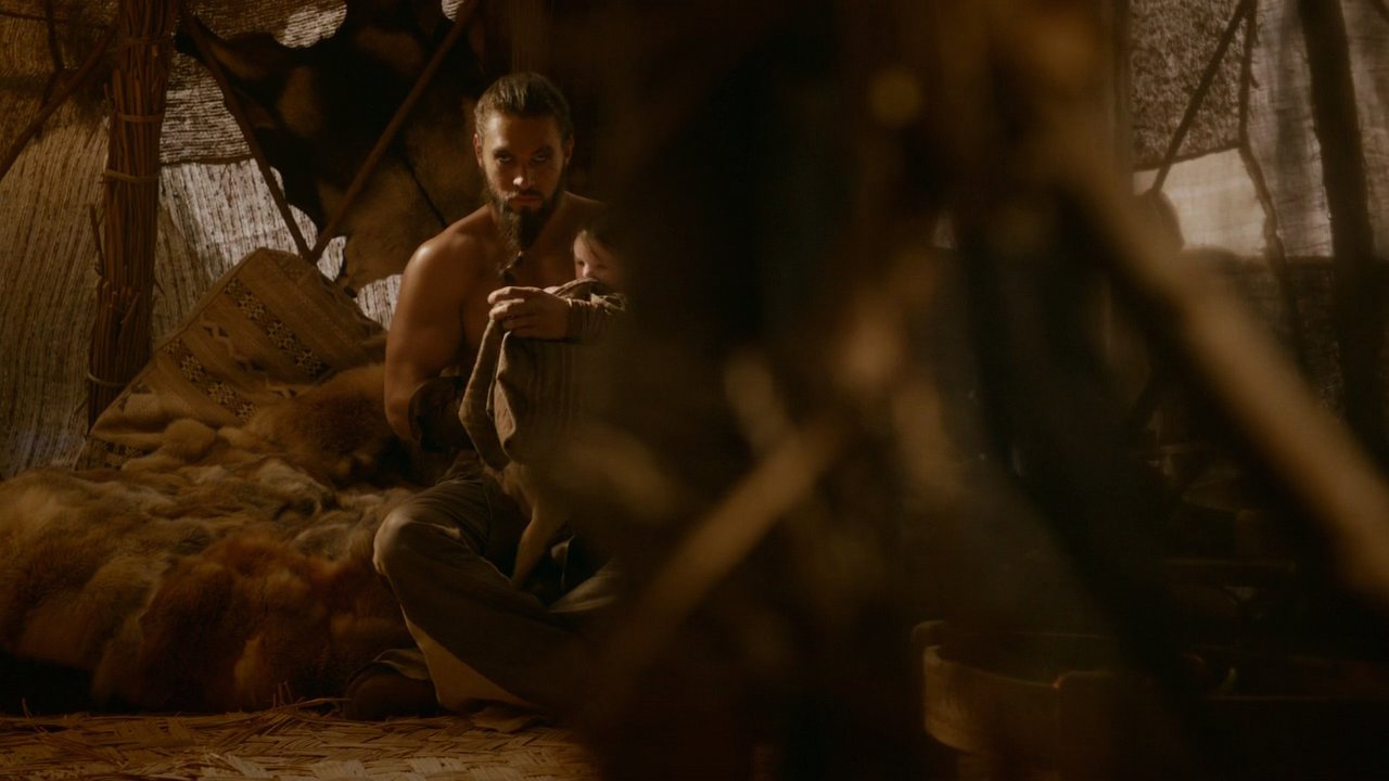
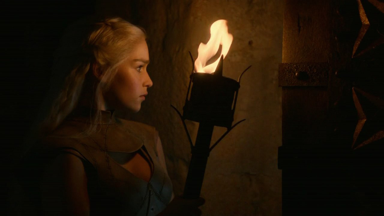
First of all, I was working with these screencaps, all downloaded from Home of the Nutty:


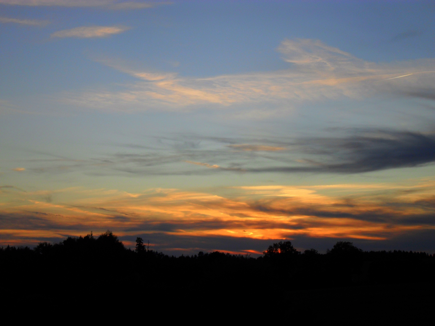
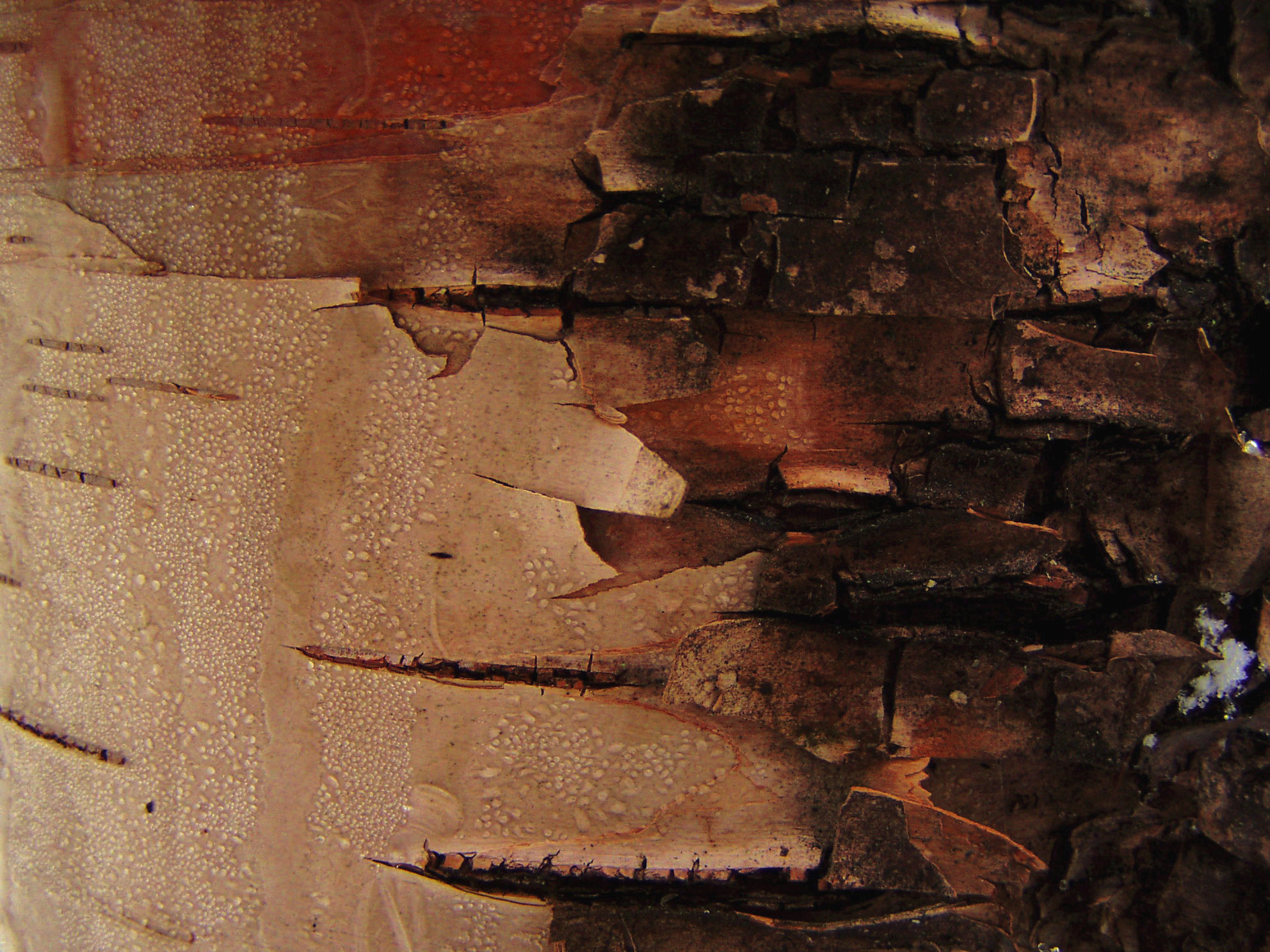
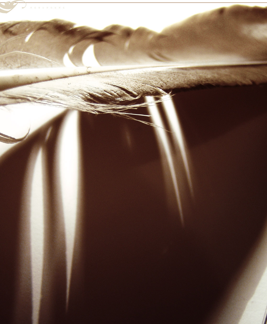
I also used following stock photos, first one being my own and the rest of them from Resurgere:
Step 1 - Blending
Now having our resources, we can start. Open a clean canvas (I like to work with 1440x900px sizes, but it is totally up to you) and fill it with background colour. For my piece I chose the colour #B9A07D, because I knew that most of my screencaps had a reddish tint and I wanted to keep the wallpaper in shades of brown and warmish colours anyway, so I wanted to start in that colour scheme (also I find it easier to work with lighter backgrounds):
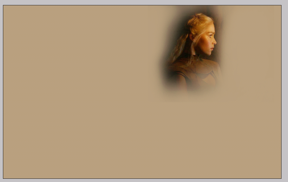
Next I took the screencap with Daenerys holding the torch, placed it on my canvas, resized to make it fit the canvas and used Eraser tool (soft round brush that is part of the preset brushes, I like to use a big brush, 200-300px depending on the size of my picture, with Opacity and Flow both down to about 65%) to erase away the sharp edges:
Then I took the screencap with Khal Drogo holding the baby, placed it on the canvas underneath the previous layer, resized it and again, used the Eraser tool to erase the unwanted parts, keeping slightly more of the picture in case I would need it for my blending later:
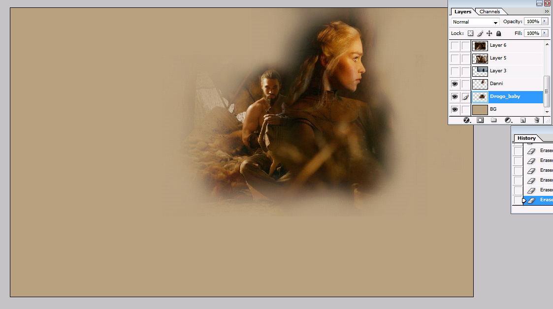
I continued with the basic blending and used the screencap of Khal Drogo's face, placed in on my canvas, resized it (keeping the picture slightly bigger than the other two, because I wanted his and Danni's face to be the main focus of the wallpaper - it was meant to be an emotional piece, so I wanted to see the emotions) and again, erased the rest to blend it with the others:
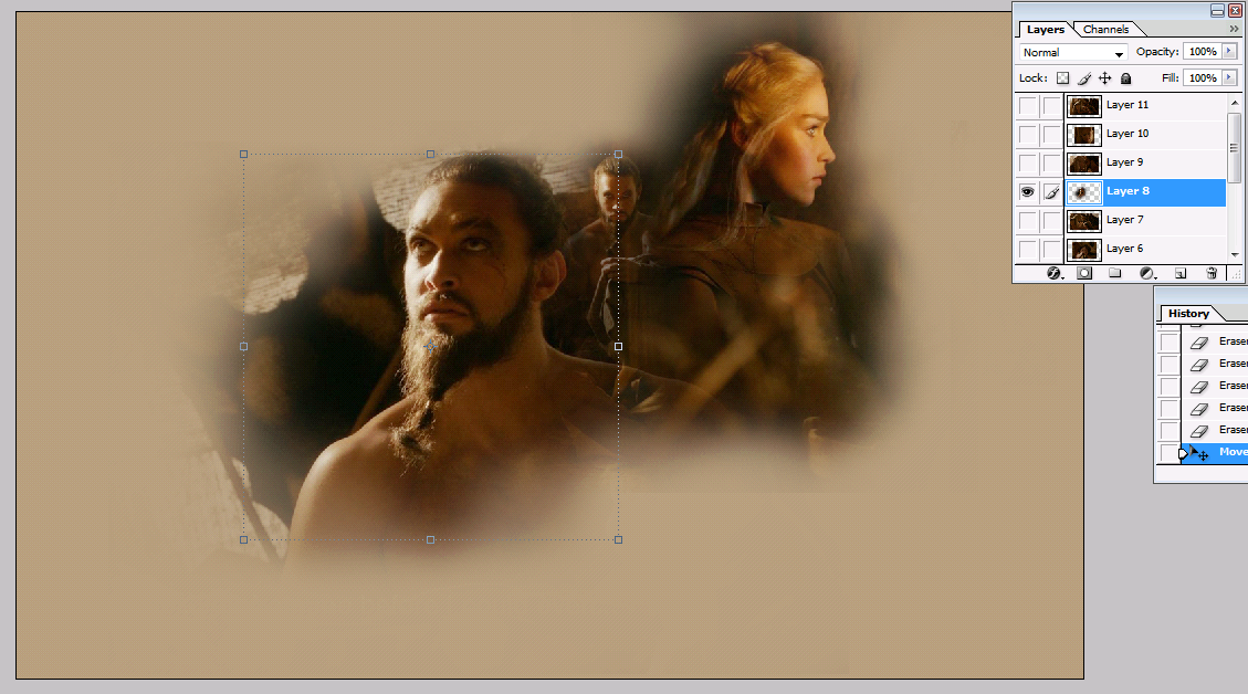
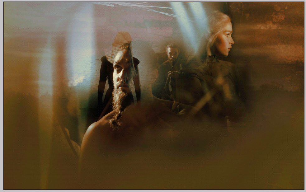
Lastly I used the screencaps of Daenerys walking away, mostly because I thought it created an interesting image visually and I was hoping I could use it to create a bit of an interesting contrast in the piece. I placed it on my canvas and set the Blending mode to Lighten (for the beginners here, this is where you can change the blending mode from normal to lighten:
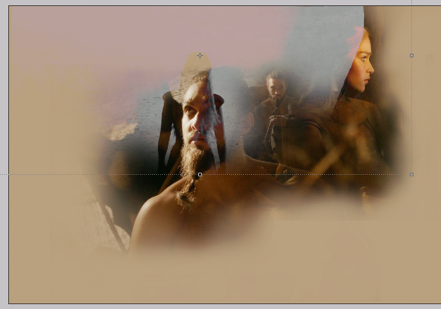
I didn't want to have my canvas too crowded at the moment, so for the moment I assumed that my blend is done and started to play around with the stock photos. First of them I chose the sunset stock, placed it underneath all of my layers (right above the background) and changed the blending mode to Soft light. because I only wanted to add a little bit of depth and texture and I didn't want for the stock to be stealing the focus away. This is what I got:
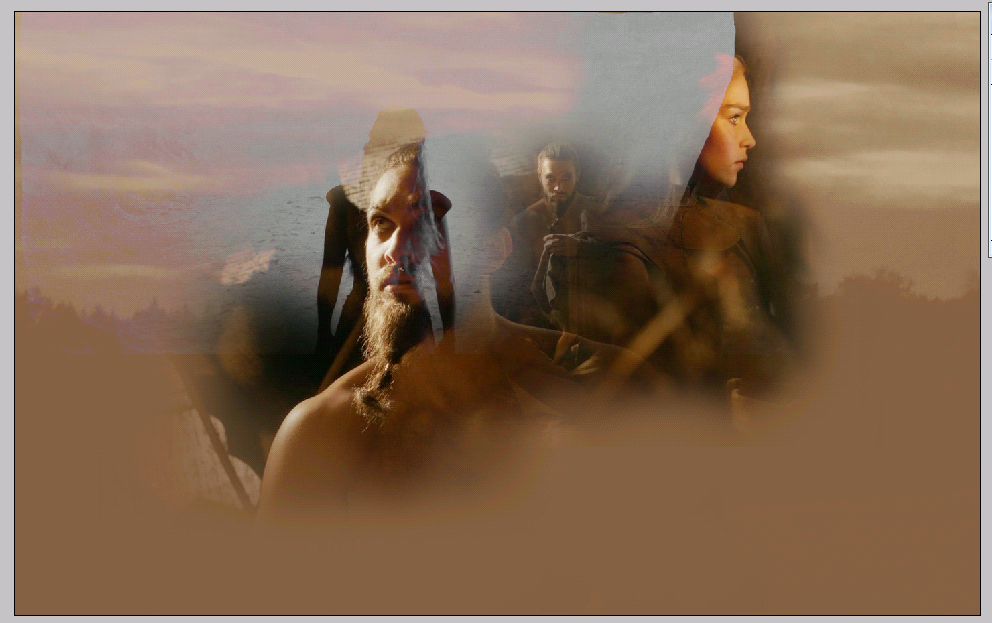
Then I noticed that despite my erasing, there was still a bit of the original dark background left on the top screencap (the one showing Daenerys looking to the right) and it felt like it was a bit too violent-looking there, so I wanted to soften it up a little and create subtler transition between the screencap and the background. For this purpose I very often use the Motion Blur filter.
First of all, I chose my Polygonal Lasso Tool and used it to roughly select an area right next to where Danni's face ended and where the dark part I wanted to get rid of began. Then, to smooth out my original selection, right click -> Feather -> 10px:
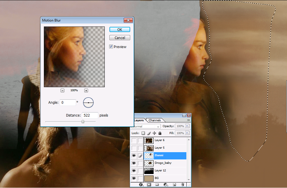
After having my selection done, I went to Filter -> Blur -> Motion Blur and set the Distance to 522px (as you can see in the picture above). The higher the distance you choose, the bigger and more visible the blur will be. Now the transition wasn't as visible as before, so I moved on with adding the rest of the stock pictures.
Next I used the stock of the tree bark, placed it right above the sunset stock and the blending mode to Soft light:
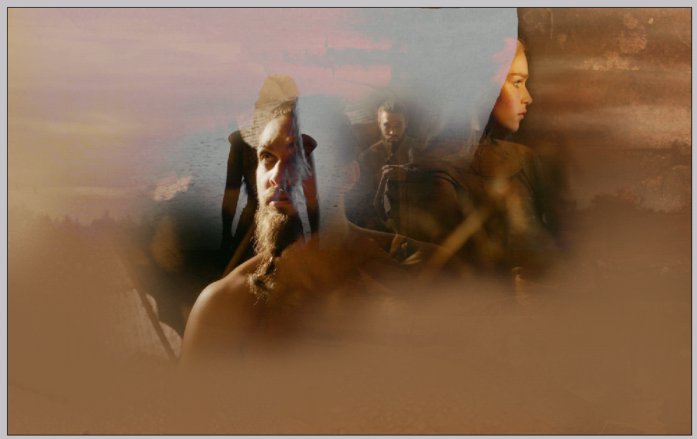
Then I used the last of my stocks, the one with the feather, and placed it on top of all my other layers, creating the effect of darker canvas with specks of light here and there:
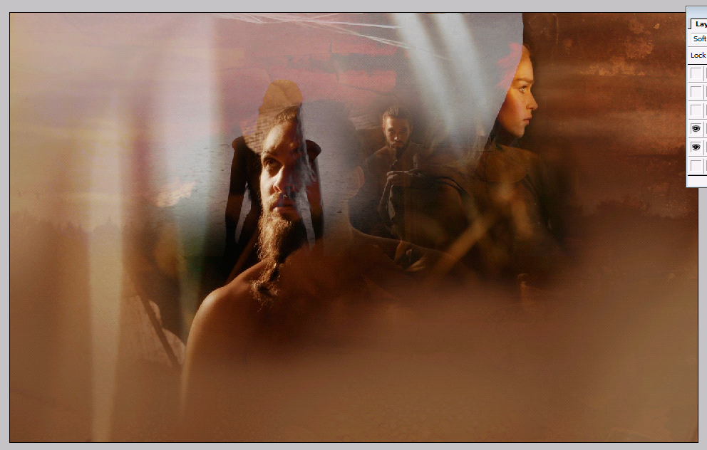
At that moment I noticed that the transition between the blended screencaps and the light-beige canvas was a little too visible, so went back to my backgroud layer (the very first one at the bottom) and grabbed my Burn Tool, chose quite a big brush (when you do bigger areas with small brush you need to go over it a couple of times and then different parts tend to be darker/lighter and it doesn't look very homogenous - when you use bigger brush, you just need to go over the area once and keep the shade same everywhere) and set the Exposure to 37%:

Then I just brushed lightly over the parts of the background close to my screencaps to darken it up a little and make the transition less visible:
Before I continued I also noticed that the screencap with Daenerys walking away, that I placed over Drogo's face, is creating rather a sharp edge over Danni's face on the right:
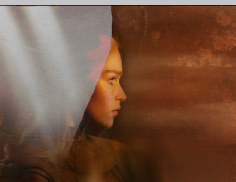
Originally I liked that effect but now it seemed a little out of place, so I just zoomed in, chose my Eraser tool (soft round brush with Opacity and Flow down to 60%) and just erased that sharp edge away:
Step 2 - Coloring
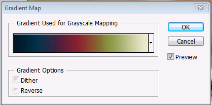
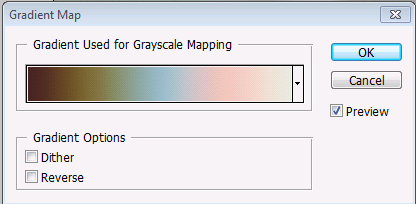
That was all of my blending done, so I moved on to the colouring. There are multiple ways how to add/and/or change the colours of your blend (selective colours, photo filters, channel mixer, colour balance...) but I find the most effective (and enjoyable to use :) to be Gradient maps (Image -> Adjustments -> Gradient map). You can either create your own ones or download already premade ones on the internet, most of the fanartists have a pack of two in their Downloads sections so they're not hard to come by. I usually use more than one seeing as that creates most precise colouring, so here are the gradients I used (downloaded from Lucid fanart, Zugma, Misplaced moments and Daydreaming, respectively).
First gradient, set to blending mode Overlay, Opacity down to 63% and Fill down to 70%:
... and the outcome:
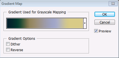
Second gradient, set to blending mode Luminosity:
.. making the wallpaper look like this:

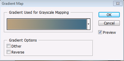
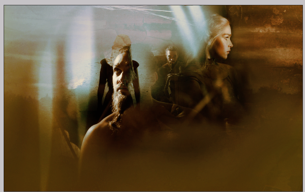
Next gradient, set to Color, Opacity down to 80% and Fill down to 40%:
... with the result:

Then another gradient, set to Overlay:
... with this outcome:
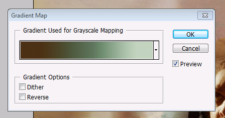
And finally the last gradient (set to Soft light), which I chose for the way it highlighted the light colours and gave the piece a little bit more of a contrast:
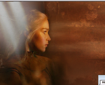
... and this is the final result when the coloring was done:
Step 3 - Finishing touches
Again, this is an incredibly wide cathegory with oh so many options. I find that lately I have a few almost "routine" steps that I like to use when creating a wallpaper like this (that is a full-canvas piece with stock images and soft blending, as opposed to tumblr-style pieces).First of all, I go over the individual screencaps in my layers and slightly enhance their quality, the most common tools being Brightness/Contrast (Image -> Adjustments), Curves (Image -> Adjustments), the Dodge and the Burn Tool for highlighting eyes and enhancing contrast (mainly on faces), the Blur tool (when I had to use lower quality pictures and the facial close-ups are coming out a bit grainy) and mainly, mainly I love and adore to use Filters.
At this point I have to make sure, that all of my blending and colouring are done, because Im about to start merging my layers in order to work with them, so any other later editations would not be possible (well, make sure to save the .psd file with your layers now and then you can always come back to them :).
I'm gonna start with Layer -> Merge visible, select the canvas and copy and paste it on the top. Then my first step is go to Filter -> Artistic -> Paint Daubs (both Brush size and Sharpness set to 1 in this case, even though usually when I work with better quality pictures, I like to use the Sharpness 2, which in this case made the picture a little too grainy) to sharpen the picture and make it a little more crisp:

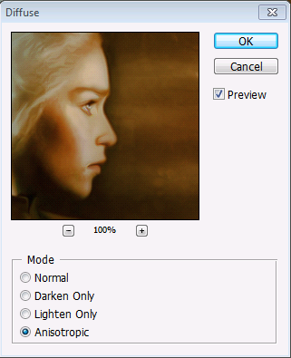
Because even very high quality pictures tend to get a little grainy and noisy here and then when you artificialy sharpen them, Im gonna add a little bit of blur. Again, merge your layers, select the canvas and copy and paste it on the top. Then go to Filter -> Stylize -> Diffuse and there choose Anisotropic. You can now adjust the Opacity of the layer based on your liking, but I didnt want mine to be too blury so I took the Opacity down to 55%:
... and here is the result so far:
As a next step I merged my layers again, selected the canvas, copied and pasted on top of the layers and then went back to Filter -> Artistic -> Paint Daubs and set the Opacity down to 90%, to bring back a little bit of the sharpness and also create a sort of a painted effect (as explained in a tutorial by Wenj, who elaborates more on this topic there).
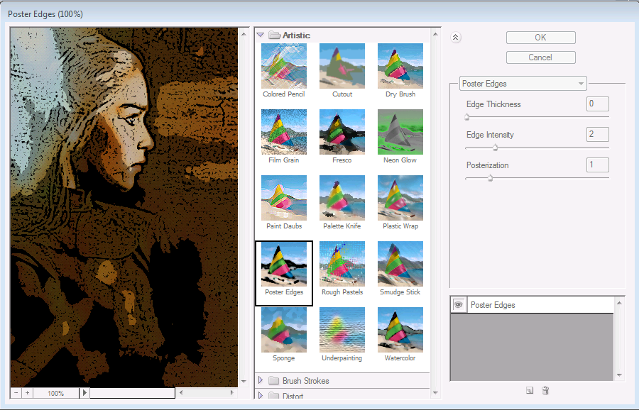
That being done I merged + selected + copied and pasted my canvas again and finished with the filters by choosing the Filter -> Artistic -> Poster edges with Edge thickness 0, Edge intensity 2 and Posterization 1:
The result of this is quite intensive, so I took the layer opacity down to 20% and then chose my Eraser tool and basically erased all of the parts of the layer that weren't a part of the background, because I wanted this effect specifically to enhance the contrast and sharpness in the background textures/stocks. This result of this is here:

Step 4 - Text
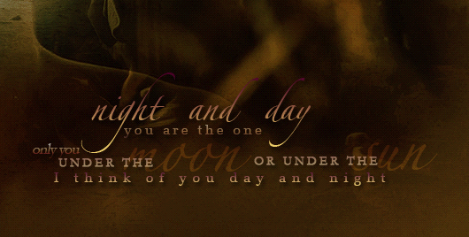
As a last step I added my text, in this case lyrics from 1934 song Night and Day which I thought fitted lovely for the relationship between the two main characters. I added the words, first in different fonts and colour a couple of shades lighter than my original background:

... and then I used the effects and techniques described in my tutorial on text effects to achieve this look:
That being done, we have finished the whole piece!
Disclaimer
This website is not connected to any celebrity, television show or movie that's featured in the site. All artwork here were made by me, Destiny. Don�t steal, direct link or whatever, please.Random wallpaper
Recent additions

...see all
Quick links
SLAYERCON
SERIESCON
DELICATE AWARDS
The rebels

Find me at

Current quote
Layout info
Made by: Destiny
Name: The heartland
Version: 5
Credit: x x x xx
Site info
Owner: DestinyCoding: Destiny
Hosting: amazing Dee
Since: 22.2.2011
Online:
Total:
Link back
![]()